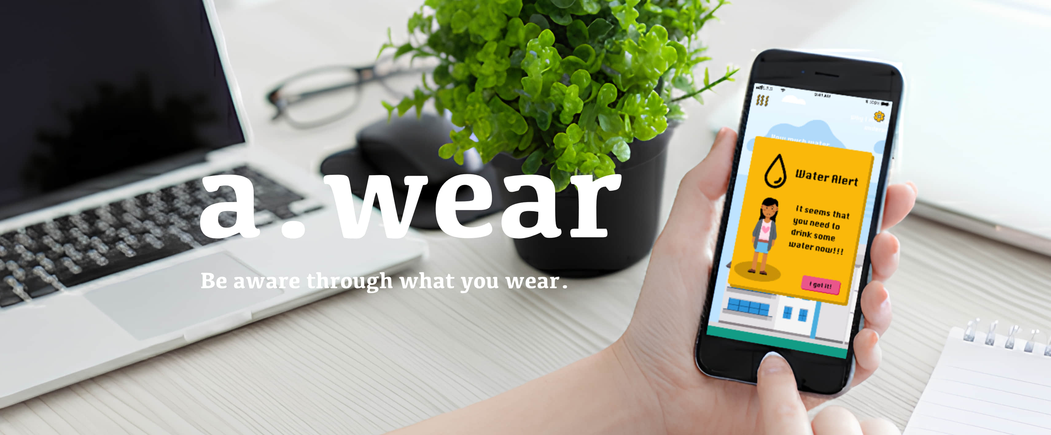
A mobile companion app concept that turns smart-wearable data into empathetic, context-aware daily guidance for teenagers.
- Role: UX/UI Designer (Interaction design, feedback logic, visual language)
- Duration: 12 weeks
- Team: Group work; I was responsible for the App independently.
- Outcome: Interactive mobile app prototype demonstrating empathetic feedback loops
The Project Context
The project’s vision was to promote Uniqueness and Self-Acceptance by enabling teenagers to feel more comfortable with the physiological changes they experience.
To solve this, we moved beyond just a product and defined a customized service strategy to help teenagers:
- Understand and love their bodies better.
- Focus on self-improvement through physical activity and regular feedback.
Research Insight
From the research, three insights became central to the design:
- Generic health metrics often increase anxiety instead of motivation.
- Teen users respond better to gentle, contextual prompts than explicit instructions.
- Feedback timing and tone matter more than data accuracy alone.
System Overview: Bridging Biometrics and Emotional Well-being
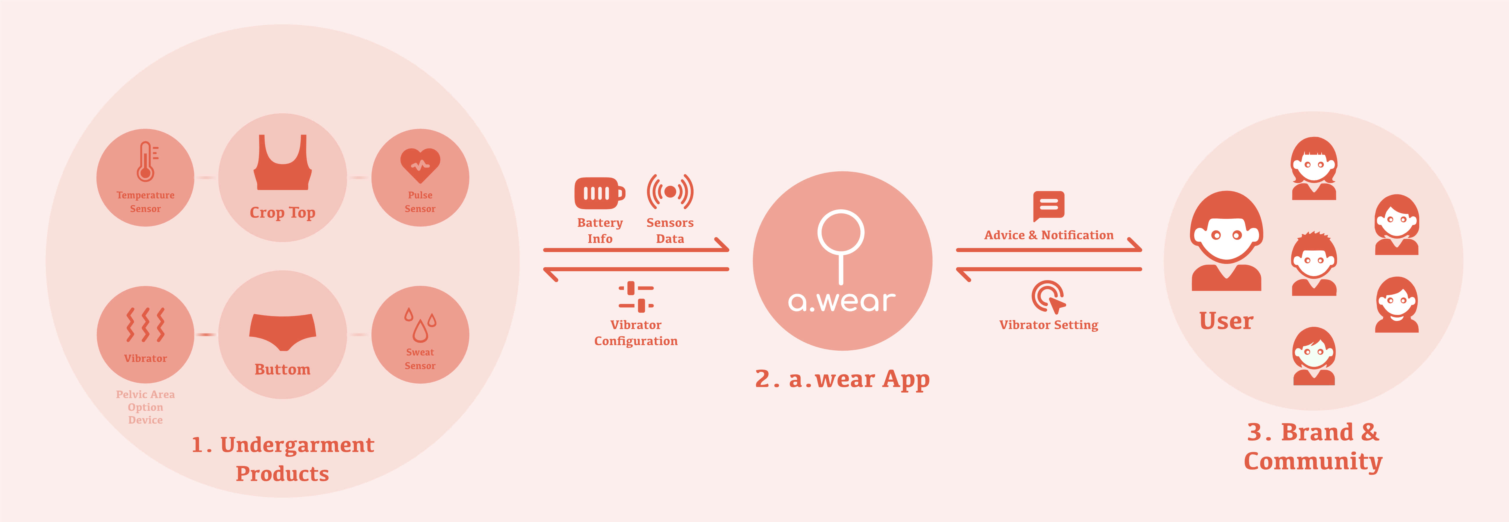
To deliver on this principle, a.wear was conceived as a Product-Service System (PSS) that translates physical change into actionable, positive digital feedback.
Why an App?
- Continuous interaction: The problem unfolds across the day, not at a single moment
- Personalized feedback loops: Data interpretation and guidance require contextual adaptation
- Coordination hub: The app mediates between wearable sensing, user reflection, and action
Prototype
Prototype Coverage
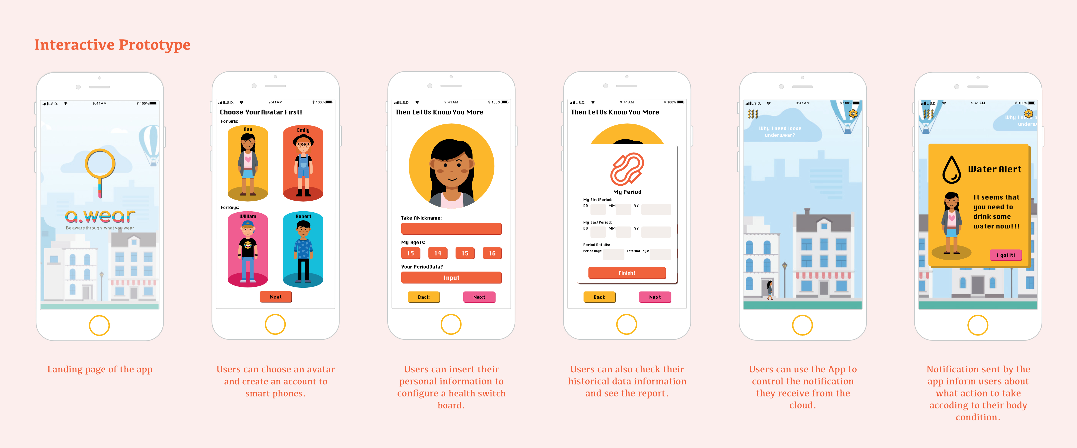
- Covered: onboarding, daily loop, insights, alerts, vibrator setting, system settings
- Not covered: edge cases, account recovery, battery charging, etc.
Key Flows
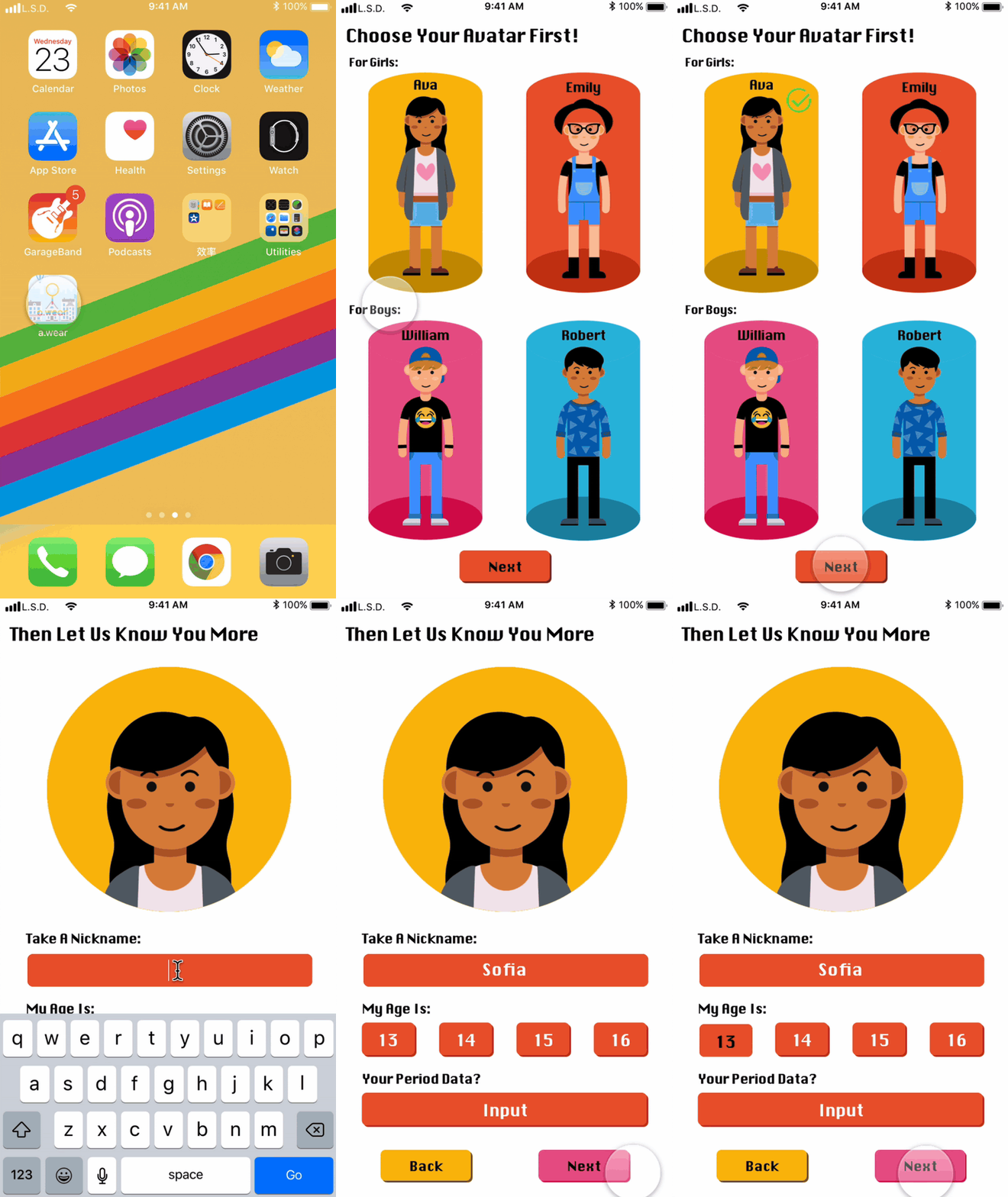
1. Onboarding → device pairing → personalization
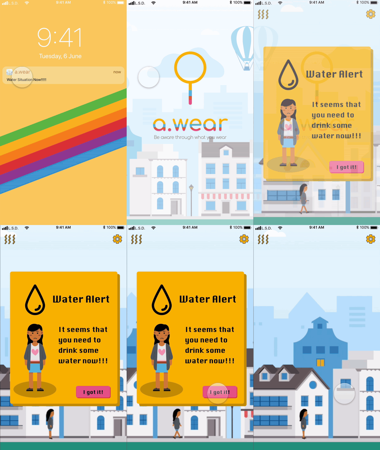
2. Real-time feedback → alert → resolution
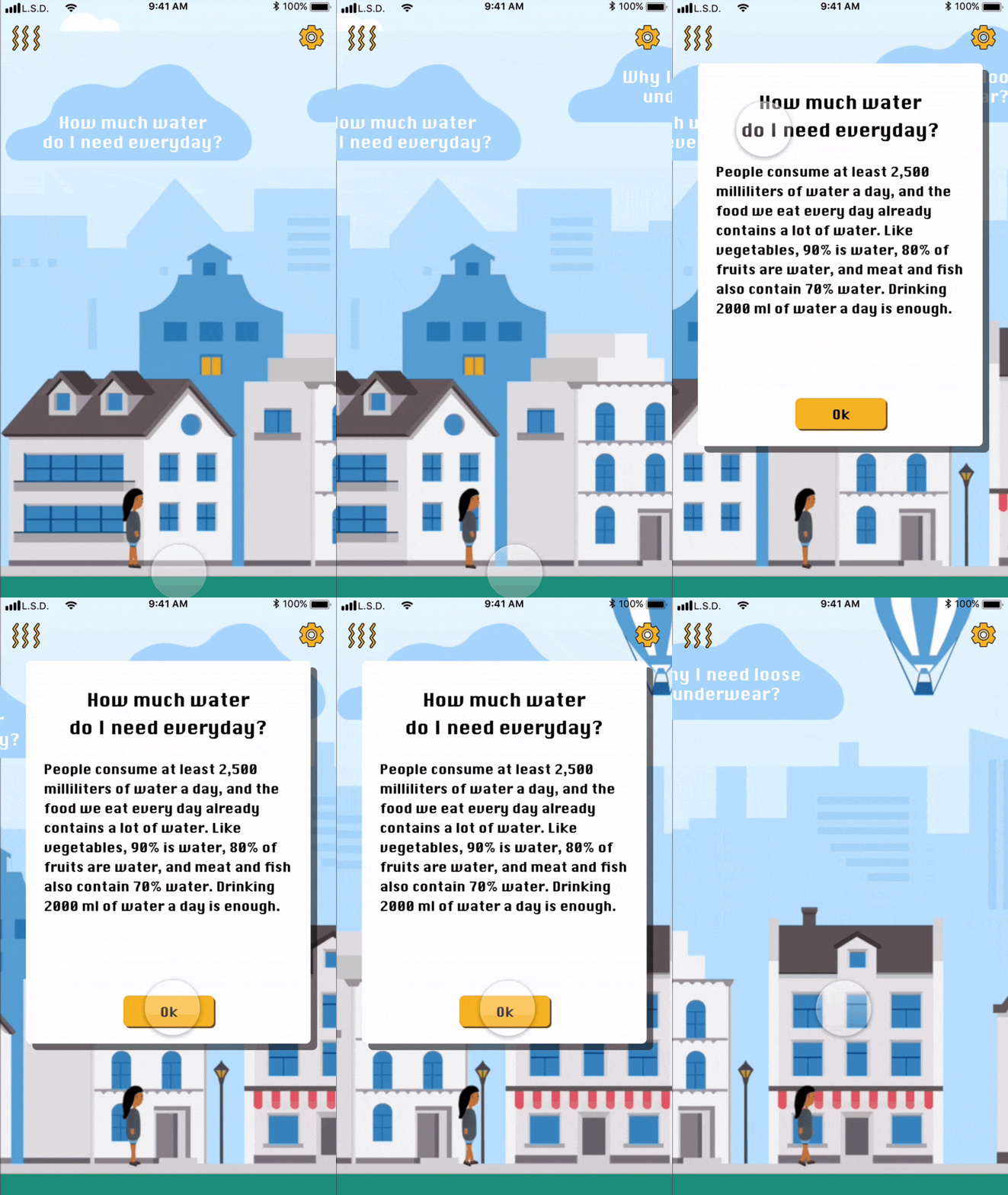
3. Interactive Cloud → insights → behavior loop
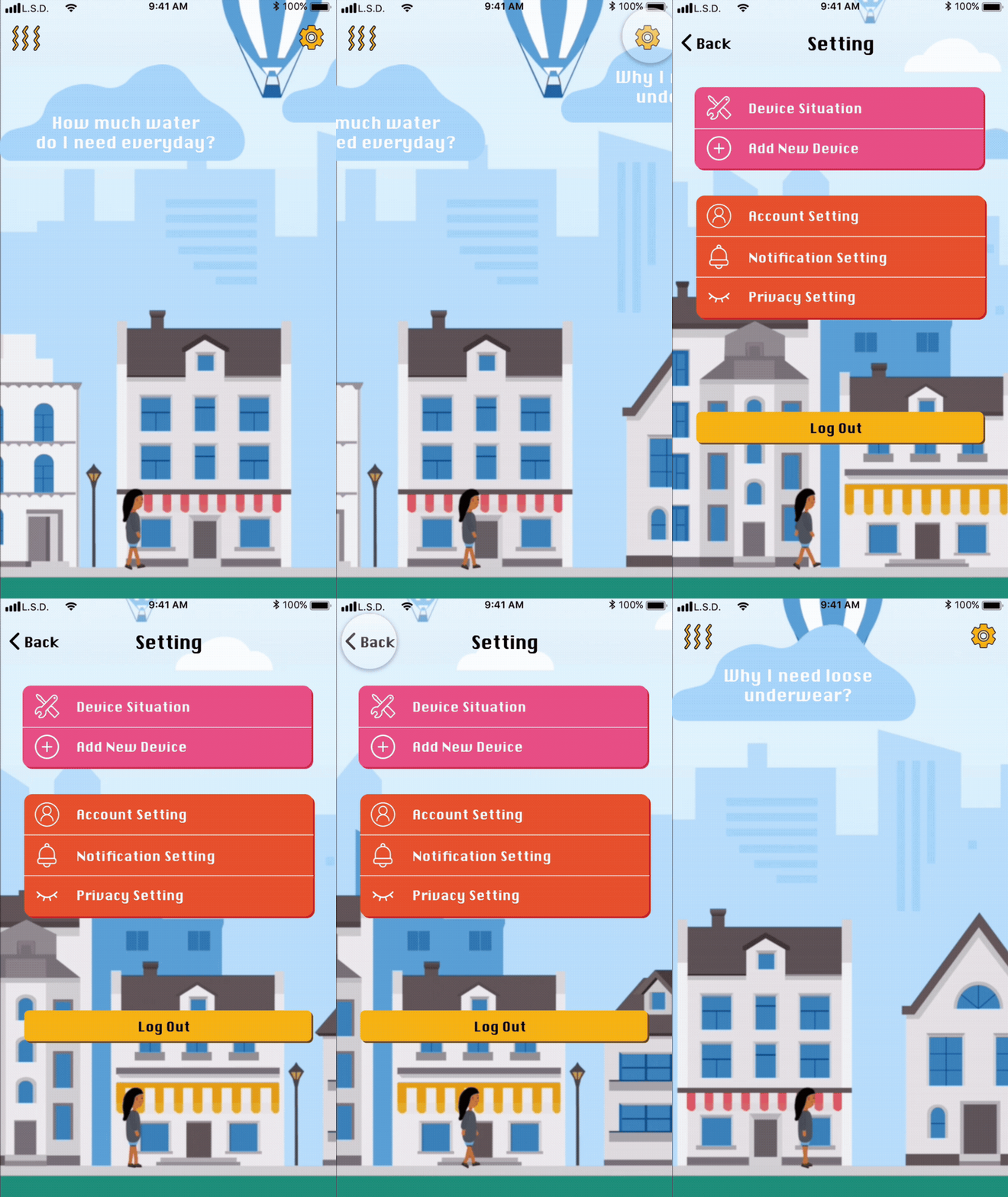
4. Settings → privacy / data control
Design Rationale
- Data-to-Action Feedback Loop: Eliminating Friction
- Gamification & Novel Interaction: Expressive & Playful Visual Language
- Sensitive Data Configuration: Designing with Empathy
Outcome
- Successfully translated a sensitive emotional issue (teen body image pressure) into an empathetic, actionable app experience.
- Dual-mode feedback (immediate alerts vs. casual cloud prompts) balanced guidance, autonomy, and non-judgmental interaction.
- Expressive, gamified UI elements proved effective in building trust, engagement, and a youth-oriented brand identity.
Reflection
This project strengthened my ability to design low-friction, emotion-centric interactions for sensitive health contexts. Prioritizing empathetic feedback over competitive metrics challenged conventional UX assumptions for wearable systems.
The hardest trade-off was balancing expressive UI with clarity and data trust. With more time, I would validate assumed emotional responses with longitudinal user studies and refine prompt phrasing for deeper personalization.
This page presents a curated overview of the project. The full case includes detailed research, design iterations, and reflections.
Read full case